Category Archives: adsussing

Psst! Hey, kid! Are you being abused?

Kids See Bruises
Kids and/or Short People Ad Campaign

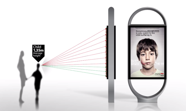
I recently saw an ad with an interesting technological approach, which would be used ostensibly to communicate to a particular group of people.

Hey ShesAllWrite, let’s suss this ad!


Michael:

This ad is pretty damned cool, at least from a technological perspective. It’s like those pictures of Jesus that follow you. I love those pictures! As a kid, I had some cool, postage-sized pictures of Bruce Banner and Peter Parker that turned into The Hulk and Spider-Man, respectively, depending on how you looked at them.

However, I think the ad is a far more effective campaign as self-promotion for the company that created the ad (“Look at this cool ad we made!”), and less a help for any kids in need.

Is the rationale of the ad that a kid is going to be accompanied by his abuser, and that while the abuser sees one thing, the kid sees something different that speaks directly to him? CALL FOR HELP, KID! IT’S OKAY! YOUR DAD CAN’T SEE THIS! UNLESS YOUR DAD IS VERY, VERY SHORT!

Is the rationale of the ad that the abuser would avoid the ad if it had a phone number to call, but without the number the abuser has no issue with walking by an ad that specifically talks about child abuse? Wouldn’t the abuser potentially avoid that ad as well?

Why not do this — why not have an ad geared toward adults that has nothing to do with child abuse? Have it be an ad for a vacation resort getaway that doesn’t exist. Then only the kids will see the real ad, and that ad will be about child abuse.

I think the use of technology in this ad campaign is actually a little creepy. This is yet another form of advertising that targets children. Advertisers already resort to countless scummy ways to separate kids from their parents. They actively try to turn kids into aggressive consumers who will harangue their parents to buy them things.

And with this ad, we see another potential, insidious mechanism for advertisers to specifically target kids.

Maybe, maybe this particular instance of advertising is for a noble (yet ineffective) purpose, but I see this technology quickly repurposed for shoes/videogames/movies/clothes/whatever, as another means of turning their kids against their parents, with familial feelings to be replaced by brand loyalty and a bottomless desire for material things.

BOOOOOOOOO!


Carla:

At first glance, I thought this ad campaign was genius. I still think it’s genius, but some of the warm fuzzies have worn off.

Let’s start with why I love the campaign. I love it because it presents a simple solution to a complex problem: How to talk to two people at the same time, and effectively deliver a different call to action to each. Brilliant! Well done! Applause!

*needle scratches across record*

WAITAMINUTE! What happens when brands use similar technology? They can now say something to my kid that I can’t see. They can have a conversation (albeit one-way) with my kid that I am not a part of. And they can sweet-talk ME while they’re doing it. Oh, hell no!

This mechanism wouldn’t work very well for products geared only toward children because the campaign needs parallel messaging in order to work its magic, but think of these sinister (but no less genius) applications–campaigns for Disneyland Resort vacations, fast food or minivans. Talk to Mom and Dad about all-inclusive deals, mealtime convenience and vehicle functionality; talk to kids about Mickey Mouse, kids’ meal toys and rear-seat DVD players. Parents would no longer be making decisions about grown-up purchases by themselves–they’d have the kiddo contingent to contend with. In the wrong hands, this super power could be used for evil. It could also be used for good in other PSA campaigns–healthy eating, anti-smoking, anti-drug, and so on. I’d like to think we could trust advertisers not to exploit our relationships with our children for financial gain, but I know better.

I did want to touch on Michael’s comment about the effectiveness of the specific campaign in question. I know a little bit about abuser-abusee relationships and I think I can speak on why this would be effective. Being confronted with, or threatened with being outed or punished for his behavior causes an abuser to become very insecure and hostile. The hostility is almost always absorbed by the person he is abusing. By giving the adults a benign and fairly non-confrontational ‘stop-and-think’ message, the campaign avoids creating conflict between the abuser and his victim. The message that is displayed to the child would almost surely enrage the abuser and plant seeds for future conflict between the abuser and his victim. Domestic violence PSA campaigns have always had to tiptoe around this issue.

I also wanted to mention that I agree this campaign is a great publicity-generator for Grey Group–the agency that created it.

I can’t quite give it a boo, so I give it a cautious yay.
 

Adsussing – L’Oreal

UPDATE:

*******

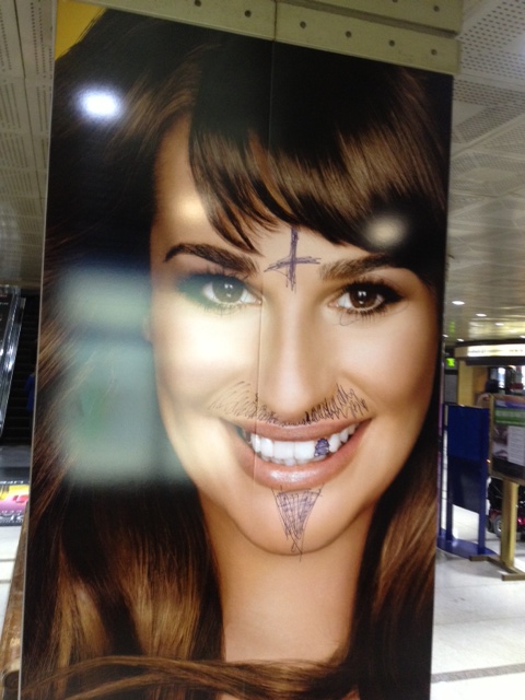
It looks like someone has brazenly defaced one of the ads in Union Station.  Is nothing sacred?

Lea Michele With Facial Hair and A Questionable Tattoo

*******

So, ShesAllWrite and I do this thing, where one of us picks an ad, and we both discuss it.  It’s called Adsussing.  You know.  Sussing!  Of ads!

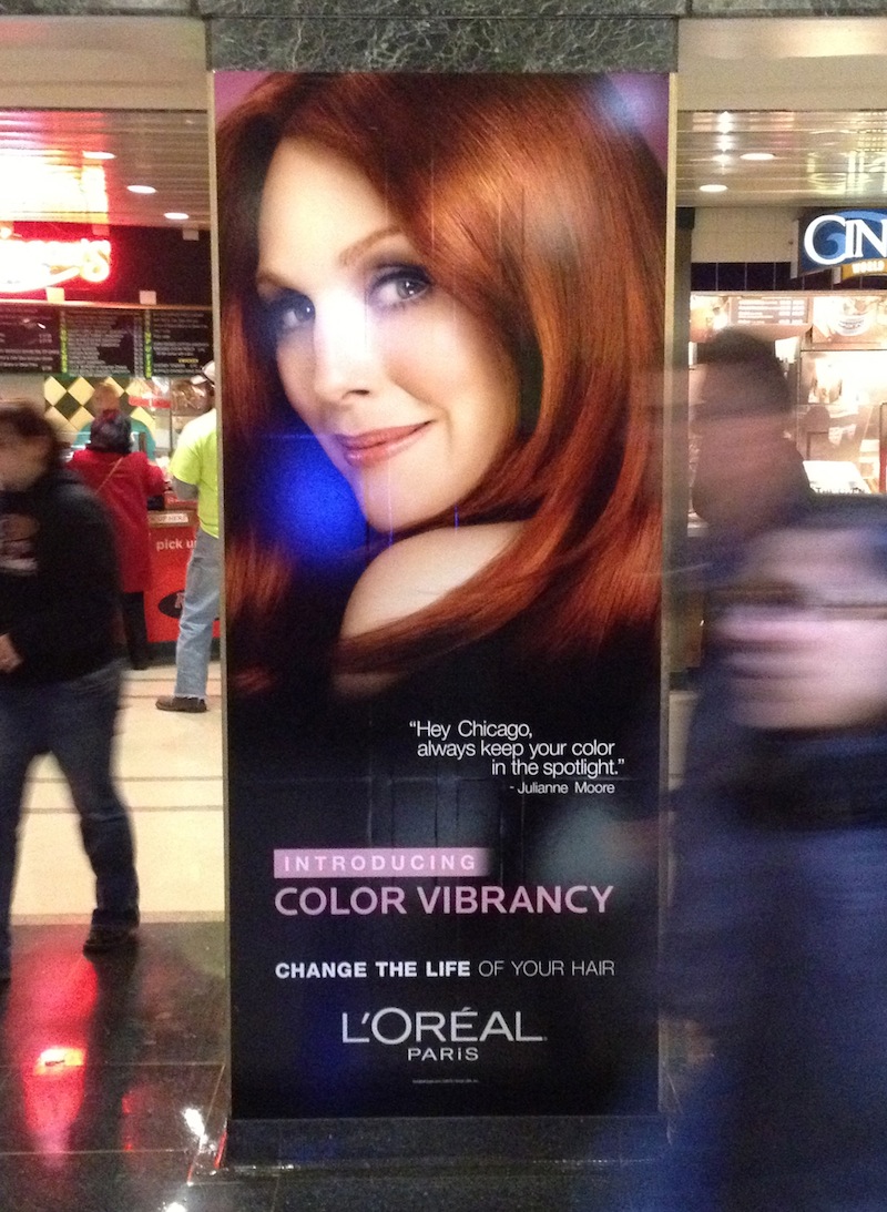
Anywho, here’s our topic for this post — an ad featuring Julianne Moore in Chicago’s Union Station.


Julianne Moore


Michael (first impression):
Hello, Julianne Moore. You have nice hair. I’ll grant you that. Why are you addressing Chicago? And when you address Chicago, do you really say, “Hey Chicago”? That’s kind of rude, Julianne Moore.

I’m used to seeing celebrities endorse products, but I find it very unusual that this ad purports to actually quote the celebrity endorser. It’s just plain weird.

So, did Julianne Moore REALLY say this? Does Julianne Moore know she is being quoted by a French beauty company? I presume she knows her image is being used to sell “Color Vibrancy”. But does she know they are using some possibly-made-up quote of hers in their ad campaign?

Are there are other train stations across the US, or even the world, where Julianne Moore has geographically-specific advice? “Hey Houston, watch out for split ends and dust devils.”

I want some sort of verification that she said this quote. Otherwise it’s a filthy lie, and I want nothing to do with these wonderful hair care products.


Carla (first impression):
My hair has a life? Why didn’t anyone tell me? Not surprisingly, this ad for hair color is painfully superficial. When I think about life-changing things, my hair never enters the picture. I get that keeping her appearance up can make a woman feel great, but L’oreal is trying to suggest that it will make her feel great to the tune of changing her life. How can you change your hair’s life without changing your own? Your hair follows you everywhere!

I think an ad like this is effective on 99.9% of people. Lives, like processed hair, become dull. Who wouldn’t want to believe that a $10 box of color holds the key to a brilliant transformation? Me and the rest of the realists, that’s who.

It’s not that I don’t color my hair, I do–I have a few grey strands I’m not ready to rock yet. But I don’t ever pretend dying my hair will change anything other than the color of my hair. I actually find it to be a tedious chore–even when someone else does it. There are a million things I’d rather do than sit with a wad of dye on my head. If L’oreal wanted to advertise to people like me, this ad would look much different. It would call out how easy it is to use, how quick the processing time is and how little it smells. But L’oreal doesn’t care about the exceptions to the rules. They want to talk to the masses, and the masses believe in quick, easy fixes to all of life’s problems.

One other thing that bugs me about this ad is that Julianne Moore is airbrushed to Bejesus and back. She’s 52 years old, and this photo of her has been enhanced to make her look like she’s in her early 20s. This sets unrealistic expectations on everyone’s part, and women lose big time. Men will always be able to find (and possibly date) women in their early 20s, but women can’t get younger. I wish female celebrities would grow a pair of ovaries and show us what they really look like as they age. There’s no shame in aging, but you’d never know it by the advertising industry.


Michael:
I am not so disappointed with Moore that she was airbrushed to hell and back, in that it’s the industry that creates these unrealistic images of women via all sorts of image manipulation. Wait, let me back up. Okay, she herself is taking the money for these ads, and unlike other ads (bottled water! a truck! microwave burritos!), selling beauty products while at the same time having every blemish digitally corrected does kind of make her a little responsible for these hokey standards of beauty being pushed.

Sheesh, I wasn’t even sure what this stupid ad was for. So it’s for hair coloring? I guess I focused so much on the stupid quote I didn’t get the ad’s stupid point. And I didn’t even notice that “CHANGE THE LIFE” line. I hope whoever thought of the “[BOLD!]CHANGE THE LIFE[/ENDBOLD!] OF YOUR HAIR” ad copy gets a case of mild diarrhea.

I neglected to mention that there were other celebrity women in this ad campaign at Union Station. They each had quotes attributed to them, but none of the quotes were Chicago-specific like Moore’s.

Lea MicheleJennifer Lopez

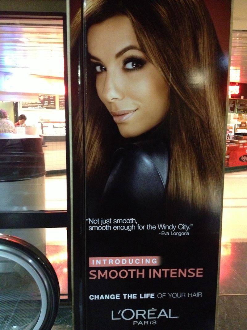
Eva Longoria


Whoops!  Now that I have looked at them, Eva Longoria totally has our number as a Windy City.  Bravo, Ms. Longoria!


Carla:
Now that I’ve seen a few more of these ads in Union Station, I see that they are not for hair color, but for hair care products (shampoos, conditioners, styling aids) for a vast array of hair types. The fact that I couldn’t immediately discern this from the photo of the first ad Michael sent me is the worst thing about this ad campaign. With any form of display advertising, a brand has 3-5 seconds to tell the consumer what their product or service is, what it will do for them and how it will do this thing better than any other similar product or service. L’oreal failed big time on this front. Another fail is that there are too many varieties of L’oreal hair products in this campaign–the value proposition messages are too scattered. L’oreal would have been better off focusing the campaign on one product type, or collection from this line–the color-protecting collection, for instance. There are too many calls to action in this campaign, and the ads don’t communicate clearly or concisely, so as a consumer, I have no idea which of these products I am supposed to want or why. I give this campaign a solid F.

Adsussing

I don’t think as much as I would like, but one thing that gets me to thinking is repetition.  If I see something on a regular basis, I might start thinking about it.

I passed by a large bus stop ad on my way to work over the course of a couple months.  The ad started to bother me.  And I started thinking about it.
I thought it would be interesting to dissect this ad (and potentially other ads) in a completely unscientific, haphazard way, and I enlisted Carla for her help and opinion.  We want to suss some ads, folks.
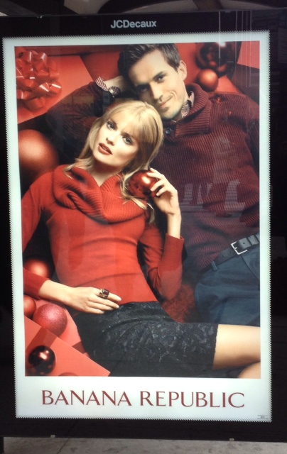
Here’s the ad.
Michael:
What the hell is it saying?

The focus of the ad is definitely the woman.  She’s looking at you/me/the viewer with a “come hither” look.  She’s holding a Christmas ornament that looks kind of like an apple.  It’s forbidden fruit!  It’s kind of naughty!  It’s sexy!  She’s showing some of her leg, and her face is tilted in a submissively erotic pose.  Sex sells!  She’s wearing a ring on her index finger. What does that indicate?  That she *isn’t* married?  That she’s available?  I’m not sure.

Oh, I almost forgot, there’s a guy behind her.  Who cares about this guy?!  I don’t! He’s not important at all.  It’s you/me/the viewer that is important!  We are what counts!  Look at his stupid, impotent belt!  Maybe it’s because I’m a dude, but I see nothing seductive about the man’s pose or expression.  His maroon sweater blends in the background, while the woman’s shirt pops with a brighter red in the foreground.

So what am I supposed to do, ad?  Am I supposed to buy Banana Republic clothes?  Why? So I can be like the guy behind the woman that she is blatantly ignoring?  Why would I want to do that?

The man is submissive and not pertinent to the ad. I am guessing that generally submissive men aren’t seen as meant to be identified with by the average red-blooded male ad-viewer.  So what’s he there for?  Is this an ad geared towards women?  Thoughts?

Carla:
The first thing I though when I saw this was, ‘Ha ha! That man told his girlfriend she would be able to hear Santa if she held a Christmas ornament up to her ear, and she believed him. He thinks it’s funny, and he doesn’t care if she’s painfully stupid, because she is blonde and thin and probably tall, and that’s all he wants in a girlfriend, because STATUS!’ That’s what I thought.

Silliness aside, I still think the ad is about status. A hot (by conventional American standards), blonde, thin woman, and a hot (again, by conventional American standards), fit man strewn across a pile of presents–like presents themselves–screams status to me. It is drenched in opulence. He has money–enough money to buy a pile of presents big enough for two model-thin, but very tall people to lay on; enough money to shop at Banana Republic; and enough money to attract a tall, hot, blonde woman who listens to Christmas ornaments. Everybody gets a status symbol! The presents are the couple’s status symbol; the woman is the man’s status symbol; and the $800 Banana Republic skirt is the woman’s status symbol.

Basically this ad says, ‘you shop at Banana Republic because you can afford lots of really nice stuff, and if you don’t shop at Banana Republic, you wish you did.’

Michael:
That IS funny about the woman.  She does have a dull expression on her face!

Do you think the ad as a signifier of status would repel or attract more people?  What about the people who can afford to get a shirt or a pair of pants from BR, but not an entire wardrobe?  Does the status suggested by the ad prompt them to buy the product in order to get some of the status to rub off on them?

I find this display of status kind of repulsive, but each person has their own reaction. The whole premise of buy-our-product-and-get-status ads is repulsive to me in general, so I have plenty of negative bias that affects my judgment.

Carla:
I find status display ridiculous and empty myself. I think in Banana Republic’s case, they do not want someone who can afford only one shirt, but not a whole wardrobe, to shop there. They want only wealthy people to shop there. After all, if a scrub like me was seen in a Banana Republic blouse and *shriek* a pair of Old Navy jeans, that would tarnish their brand and the image they are trying to sell.
I don’t think the ad is about convincing people to spend more on their clothes; I think it’s about convincing people who have more to spend on their clothes to spend it at Banana Republic, and not Ralph Lauren or Donna Karan. They use traditionally attractive people to delude the wealthy into thinking their clothes will make a big ol’ honkin’ schnoz (assuming they haven’t had it fixed, savages) look like a perfect Barbie button nose.

They also want to plant seeds in the minds of those who will one day become rich (maybe by marriage–or even the old fashioned way, by working hard) that Banana Republic is where you want to shop when you get you some money. But don’t come around until you have some money, okay?

*************

What do you guys think?