Psst! Hey, kid! Are you being abused?

Kids See Bruises
Kids and/or Short People Ad Campaign

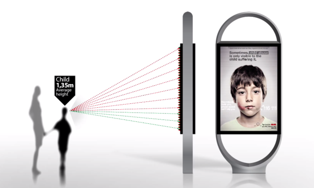
I recently saw an ad with an interesting technological approach, which would be used ostensibly to communicate to a particular group of people.

Hey ShesAllWrite, let’s suss this ad!


Michael:

This ad is pretty damned cool, at least from a technological perspective. It’s like those pictures of Jesus that follow you. I love those pictures! As a kid, I had some cool, postage-sized pictures of Bruce Banner and Peter Parker that turned into The Hulk and Spider-Man, respectively, depending on how you looked at them.

However, I think the ad is a far more effective campaign as self-promotion for the company that created the ad (“Look at this cool ad we made!”), and less a help for any kids in need.

Is the rationale of the ad that a kid is going to be accompanied by his abuser, and that while the abuser sees one thing, the kid sees something different that speaks directly to him? CALL FOR HELP, KID! IT’S OKAY! YOUR DAD CAN’T SEE THIS! UNLESS YOUR DAD IS VERY, VERY SHORT!

Is the rationale of the ad that the abuser would avoid the ad if it had a phone number to call, but without the number the abuser has no issue with walking by an ad that specifically talks about child abuse? Wouldn’t the abuser potentially avoid that ad as well?

Why not do this — why not have an ad geared toward adults that has nothing to do with child abuse? Have it be an ad for a vacation resort getaway that doesn’t exist. Then only the kids will see the real ad, and that ad will be about child abuse.

I think the use of technology in this ad campaign is actually a little creepy. This is yet another form of advertising that targets children. Advertisers already resort to countless scummy ways to separate kids from their parents. They actively try to turn kids into aggressive consumers who will harangue their parents to buy them things.

And with this ad, we see another potential, insidious mechanism for advertisers to specifically target kids.

Maybe, maybe this particular instance of advertising is for a noble (yet ineffective) purpose, but I see this technology quickly repurposed for shoes/videogames/movies/clothes/whatever, as another means of turning their kids against their parents, with familial feelings to be replaced by brand loyalty and a bottomless desire for material things.

BOOOOOOOOO!


Carla:

At first glance, I thought this ad campaign was genius. I still think it’s genius, but some of the warm fuzzies have worn off.

Let’s start with why I love the campaign. I love it because it presents a simple solution to a complex problem: How to talk to two people at the same time, and effectively deliver a different call to action to each. Brilliant! Well done! Applause!

*needle scratches across record*

WAITAMINUTE! What happens when brands use similar technology? They can now say something to my kid that I can’t see. They can have a conversation (albeit one-way) with my kid that I am not a part of. And they can sweet-talk ME while they’re doing it. Oh, hell no!

This mechanism wouldn’t work very well for products geared only toward children because the campaign needs parallel messaging in order to work its magic, but think of these sinister (but no less genius) applications–campaigns for Disneyland Resort vacations, fast food or minivans. Talk to Mom and Dad about all-inclusive deals, mealtime convenience and vehicle functionality; talk to kids about Mickey Mouse, kids’ meal toys and rear-seat DVD players. Parents would no longer be making decisions about grown-up purchases by themselves–they’d have the kiddo contingent to contend with. In the wrong hands, this super power could be used for evil. It could also be used for good in other PSA campaigns–healthy eating, anti-smoking, anti-drug, and so on. I’d like to think we could trust advertisers not to exploit our relationships with our children for financial gain, but I know better.

I did want to touch on Michael’s comment about the effectiveness of the specific campaign in question. I know a little bit about abuser-abusee relationships and I think I can speak on why this would be effective. Being confronted with, or threatened with being outed or punished for his behavior causes an abuser to become very insecure and hostile. The hostility is almost always absorbed by the person he is abusing. By giving the adults a benign and fairly non-confrontational ‘stop-and-think’ message, the campaign avoids creating conflict between the abuser and his victim. The message that is displayed to the child would almost surely enrage the abuser and plant seeds for future conflict between the abuser and his victim. Domestic violence PSA campaigns have always had to tiptoe around this issue.

I also wanted to mention that I agree this campaign is a great publicity-generator for Grey Group–the agency that created it.

I can’t quite give it a boo, so I give it a cautious yay.


Do No Bird Harm

Nest Beard
Exterior flood lights with a nest beard.

A couple weeks ago I was exiting the side porch of my house and saw some junk hanging from over the door.  It was a nest.  Aw, heck.

What should I do?  Should I move it? Had a bird laid her eggs there yet?  I couldn’t get to a place where I could actually see into the top of the nest.  I did what I do many times in uncertain situations —  nothing.

When I was a kid, our neighbor had a big pine tree that butted up against our driveway.  I remember hearing some squeaking coming from the tree when we got home one day.  I looked closer through the branches and saw a baby bird.  It was on the ground, and didn’t appear to be happy about it.  I wanted to do something.

It must have fallen out a nest up in the tree.  I asked if we could move the baby, find the nest, something.  My folks didn’t know what to do.  We left it there.  It took a couple days for the baby bird to stop squeaking.  Ugh.

I’ve gone out a few times in the last week and a robin has flown from the nest as I open the back door.  I don’t want to kill any baby birds. And I don’t want to freak out Mama Robin every time I want to go to my backyard.

I looked on the web, seeing if anyone had recommendations about maybe moving the nest to a less-trafficked area.  I found some anecdotes about successfully moving a bird’s nest, but most people said not to do it.  Others even said it was a crime, a violation of the Migratory Bird Treaty Act of 1918.

I’m going to have my family stop using the back door, at least during the spring.  It will be a mild inconvenience, but maybe we won’t kill any baby birds.  That would be nice.

Hooker Motels!

Classic Splotchy

The part of my old SPLOTCHY DOT COM site I put the most work into was probably the Hooker Motels section.

An Adventure In Living

Back in Chicago in the late 90s, old, beaten-up motels dotted the lovely diagonal street North Lincoln Avenue, all the way from Foster to Devon.  I already loved Lincoln Avenue, because, HELLO!  DIAGONAL STREET ON A GRID-LIKE CITY LAYOUT!  Okay, I don’t know why a diagonal street held such appeal for me.  I will say that I love Elston Avenue, and Milwaukee Avenue, even Clark Street, which is only occasionally diagonal.  I like diagonal streets.  Let’s leave it that.

The motels all had a dilapidated, low-rent Vegas charm to me.  What is a dilapidated, low-rent Vegas charm, you ask?  Well, lots of neon signage, for one.  Also, overly ambitious motel names.  The Stars.  The Apache.  The Acres.  And yes, sometimes, the mischievous motel name.  The O-Mi!

So, I went about cataloguing the motels.  There were a lot!  Over 10!  That’s actually a lot.  Trust me.  I took pictures in the daytime.  I took pictures at night.

At the time, I was visiting the Lincoln Square record store Laurie’s Planet Of Sound a lot.  I got to know the owner, John.  He was a nice guy.  I mentioned I was devoting part of my website to the motels on Lincoln Avenue, and he thought it was a cool idea.  He offered to call all the motels and get rates.  He even asked me if I wanted him to inquire about hourly rates, too.  Hell yes I did!

I pulled out all the stops for the website.  I created an animated “Hooker Motels” GIF for the page heading.  I created pseudo-neon links that lit up when you hovered your mouse over them.  It was the bleeding edge of the Internet, baby!

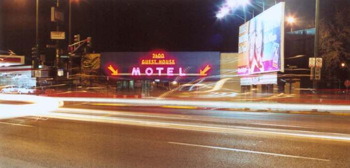
Guest House Motel
A favorite Hooker Motel pic. I think this was taken by my friend Lance, who accompanied me on at least one nighttime photo session.

During the time I was documenting the motels, a few got knocked down.  The Acres.  The Spa.  NO!!! THE SPA!!!!!!  Oh, that was the crown jewel of the Hooker Motels.  I was lucky to talk to the daughter of the owner of The Spa after it was closed but before it was torn down.  She sold me a light fixture, and told me stories about rock bands that used to stay there.

Not long after The Spa was knocked down, I stopped maintaining my site.  SPLOTCHY DOT COM just sat there, all dead and static and unloved.

But, people still visited the motel pages.  It’s not like I did anything special or wonderful, but I probably had the largest collection of pictures of the motels on the web at the time.  I will admit that Google was certainly a conduit for people to find my site via slightly-unseemly searches like “HOOKER + CHICAGO”.

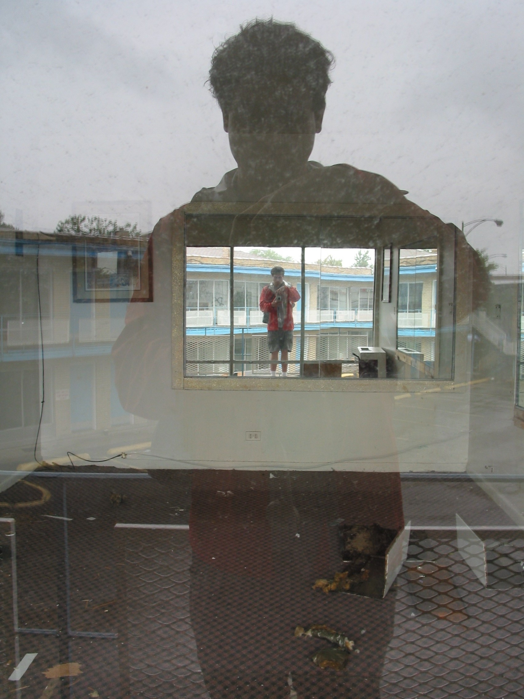
Occasionally, people would contact me about the motels. A grad student emailed me and asked if she could use some of my pictures in a thesis she was doing on the motels of Lincoln Avenue.  I happily let her use whatever pictures she wanted.  A man who bought The Stars was going to knock it down and replace it with condos.  He contacted me to see if I wanted to buy the motel’s sign for US $500.  If I had a place for it, I definitely would have.  Instead, I asked to take pictures of the motel before he knocked it down.  On a rainy day, I went there with my friend Tim and took pictures.

A room at The Stars, with me in multiple reflections.


In some ways, it’s weird having a static webpage documenting some part of the world.  It’s not a blog page.  It’s not something that will be up at the top of your site for a couple days, and then vanish into the obscurity of your archives.  It’s always present.  I think there might be an expectation from this, that your site is some sort of dependable, up-to-date resource.  But my old Hooker Motels page isn’t.  I didn’t want that responsibility.

Hey, maybe if I still lived on the north side of Chicago, and saw those motels every day, I would be the recordkeeper of these places.  I do miss them.  And I know that at least some of them are still standing, but I couldn’t tell you which ones.


Disclaimer:  This post was composed while listening to the John Fahey album “America”.  You should check it out.  It’s really nice.

Classic Splotchy

Classic Splotchy

Before this blog, I had a website.  Well, it was THIS website.  It was SPLOTCHY DOT COM.

I got my domain in the late 90’s, after playing around with some very bare-bones website experiments on GeoCities and Xoom.

In 1999-2000, I was into writing HTML files in Notepad, then uploading them to my brand new domain.

My website wasn’t a blog.  While I was maintaining the initial SPLOTCHY site I didn’t even know what a blog was. I knew I had things I wanted to say, and things I wanted to  highlight.  So I made a webpage for each topic that I wanted to devote some attention to.

I ran out of things to say, and stopped maintaining my website.  I still had the domain, though.

I was quiet on the web for a long time.  Years later, inspired by my Uncle Joe and his foray into the blogosphere, I started blogging at Blogspot.  I found other bloggers. We commented on each other’s posts, we did mixtapes together, we met up occasionally, usually around Christmas.

And then a couple years after beginning blogging, I stopped again.  A lot of the blogger community migrated to Facebook.  It wasn’t Facebook that ended my blogging career. I think I stopped mostly because I got more active on Twitter, and found new friends there while my source of friends in the blogosphere dried up.

Which brings us to today.  It might change, but I find the whole Twitter community that I felt I once belonged to now withering on the vine.  The friends I used to talk to a lot aren’t around as much anymore.  Call it a casualty of a lack of free time, I guess.  Twitter always seemed to function as a means to fill the empty spaces of a life when one has nothing else better to do.  So now, I guess many of us have moved onto the next best (or simply, just next) thing — the next time-waster.

I like the idea of blogging.  I never stopped liking the idea of blogging.  And now that I don’t feel connected greatly to anyone on Twitter or on Facebook, I feel like talking again.  What I’d LIKE to happen is that I find other bloggers (I know they’re out there), and see another community organically form.  But if it doesn’t happen, hey, I got things to say.

So, I started this blog on the place where I first started 14(!) years ago.  I started here.

My new blog sits on top of the strata of the old site that I abandoned years ago.   I thought as a bit of celebration, and a bit of navel-gazing, I would take different parts of my old website and talk about them over the course of a few blog posts.

So, stay tuned for Hooker Motels.  I think you’ll like them.

Mulholland Drive, The Diner Scene – Why Is It So Mesmerizing?

I saw David Lynch’s film Mulholland Drive a couple months ago.  The film is rather long at a running time of 147 minutes.  I liked it as a whole, but it didn’t stick with me.

Well, this one scene stuck with me.  It’s a scene set in a diner, and occurs about 10 minutes into the movie.  It’s somewhat of a self-contained short film within the larger film.  You don’t really need to know anything about what precedes or follows it. The scene features two characters that don’t figure prominently in the plot (one shows up in a cameo later — if the other one shows up, I missed it).

The movie was available via Netflix Streaming, and I found myself watching the diner scene again and again.  Sadly, the film isn’t available to stream any more, though some kind soul has uploaded the scene in its entirety to YouTube Vimeo.

Here, watch it (my apologies for the poor quality – there was a nice clip of this on Vimeo that has since been taken down):

Why does this scene resonate so much with me?  There are strange things about it.  Dan, the dark-haired man, seems to vacilliate between naturalistic acting and a more stilted line delivery.  It’s hypnotic.  Also, note how the camera doesn’t stay still during what could be a very static, stereotypical two-person dialogue scene.  The camera seems to be handheld, and actually is very slightly raising and lowering, hovering during the scene.

By the time they leave the diner to see if “the  man” is back behind the alley, the tension is already ratcheted up to a high level.  The scene takes mundane things and somehow makes them terrifying.  The pay phone, the taped-up back door spooks Dan because of its familiarity to him, and we are spooked in the process because Dan is spooked.

The use of sound contributes to the scene.  Dan says something to his friend as they leave the diner, but you can’t hear him.  When “the man” appears, the sound gets incredibly loud, then becomes muffled as Dan collapses.

Hell, I’m describing WHAT happens, but I don’t know HOW it happens.  I don’t know why this scene is so riveting to me.

Thoughts? Does it affect you?  If so, why?


Here’s a snippet of the script for this scene, taken from  LynchNet:

I think the movie improves upon the script (for example, showing Dan didn’t eat his breakfast right before they leave the diner, rather than have Herb announce that Dan is not hungry).

INT. DENNY'S RESTAURANT , HOLLYWOOD - MORNING

Two well-dressed men HERB and DAN (mid 30's) are sitting at a
table drinking coffee. Herb has finished eating his
breakfast, but Dan hasn't touched his bacon and eggs - he
appears too nervous to eat. A blonde waitress with a
nameplate saying "DIANE" lays the check on their table
smiles, then walks off.

				HERB
		Why did you want to go to breakfast if
		you're not hungry?

				DAN
		I just wanted to come here.

				HERB
		To Denny's? I wasn't going to say
		anything, but why Denny's?

				DAN
		This Denny's.

				HERB
		Okay. Why this Denny's?

				DAN
		It's kind of embarrassing but,

				HERB
		Go ahead.

				DAN
		I had a dream about this place.

				HERB
		Oh boy.

				DAN
		You see what I mean...

				HERB
		Okay, so you had a dream about this
		place. Tell me.

				DAN
		Well ... it's the second one I've had, but
		they were both the same......they start
		out that I'm in here but it's not day or
		night. It's kinda half night, but it
		looks just like this except for the
		light, but I'm scared like I can't tell
		ya. Of all people you're standing right
		over there by that counter. You're in
		both dreams and you're scared. I get
		even more frightened when I see how
		afraid you are and then I realize what it
		is - there's a man...in back of this
		place. He's the one ... he's the one
		that's doing it. I can see him through
		the wall. I can see his face and I hope
		I never see that face ever outside a
		dream.

Herb stares at Dan to see if he will continue. Dan looks
around nervously, then stares at his uneaten food.

				DAN (cont'd)
		That's it.

				HERB
		So, you came to see if he's out there?

				DAN
		To get rid of this god-awful feeling.

				HERB
		Right then.

Herb gets up, picks up the bill and goes to the cashier to
pay. Dan just sits.

As Herb is paying the bill he looks over at Dan just as Dan
is turning to look at him. From Dan's point of view Herb is
standing in exactly the same spot as he stood in the dream.
Herb gets a strange feeling, turns back and finishes up with
the cashier. He motions for Dan to follow him. Dan rises
reluctantly and he and Herb make their way outside.

							CUT TO:

EXT. DENNY'S

Now Herb waits for Dan to lead the way.

				DAN
		Around here.

Dan takes Herb across the front of Denny's to a narrow
sidewalk that leads down the side toward the back.

They begin walking down the narrow sidewalk - past a
payphone. Dan begins to sweat the nearer he gets to the rear
corner of the building. Red bricks glide by slowly.

CLOSER ON DAN

Beads of sweat cover his face. He finds it difficult to
breathe. Herb is just behind him unable to see the fear
overtaking his friend, but Herb can feel something himself.

The red bricks moving by now are coming to an end - the
corner is coming closer - the corner is now very close.

Suddenly a man - a face ... a face dark and bum-like- moves
quickly out from behind the corner and stops - freezes -
staring into Dan's eyes.

Dan lurches back. All his breath is suddenly gone. He falls
back into Herb who tries to catch him as he's falling. Dan
hits the ground unable to breathe - his eyes wide with
horror.

Herb looks up - the man is gone. He looks down to Dan.

				HERB
		Dan! ... Dan! You all right? ... Dan!

He kneels down and studies his friend. He feels for a pulse
in the neck. He listens for breathing. His friend is dead.

				HERB (cont'd)
		My God!

You Might Think That New Order Never Uses Song Titles In Their Lyrics, But You Would Be Wrong

I have a hard time remembering which New Order song is which.  Which is the one that goes “I used to think the day would never come / Dah dah dah dah dah dah dah the morning sun”?

How does “Bizarre Love Triangle” go?

Hmmm. Well, I know how that song “Situation” goes.  Oh wait, that’s by Yaz.  Yaz, you are very considerate in your  song-naming conventions!

So, you see what I mean?  Many of New Order’s songs have titles that are never mentioned in the song itself.

I was so sure they never used song titles in their lyrics (having heard AT LEAST 20 of their songs, how could I be wrong?!!), I challenged people on Twitter.

Shortly after my challenge, several people told me about some New Order songs with titles in the lyrics.  Here are a few of them.


State Of The Nation (1986) suggested by @noiseAnnoys83

Title mentioned at 1m24s.

“I saw his face and shook my head
Can you see where we can’t be
We’re losing our blood in the sea
‘Cause it’s the state of the nation  <———-
That’s holding our salvation”


Touched By The Hand Of God (1987) – suggested by @Wearentnormal

Title mentioned at 2m06s.

“And now I’m down here all alone with every feeling that I own you can’t take that away
And with every breath we take and the illusions we create will come to you someday

Will come to you someday
And I was touched by the hand of god <——–
Never knew it but I killed someone”


World In Motion (1990) suggested by @AnthonyDuffy

Title mentioned at 1m.

“Express yourself
You can’t be wrong
When something’s good
It’s never gone
Love’s got the world in motion  <———
And I know what we can do”


Regret (1993) – suggested by @Wearentnormal

Title mentioned at 0m54s.

“Maybe I’ve forgotten the name and the address
Of everyone I’ve ever known
It’s nothing I regret <———–
Save it for another day
It’s the school exam and the kids have run away”


Crystal (2001)  – suggested by @ChicoFC

Title mentioned at 0m57s.

“We’re like crystal <——- !!!
We break easy
I’m a poor man, if you leave me
I’m applauded, then forgotten
It was summer, now it’s autumn”


Here To Stay (2002)   – suggested by @ChicoFC

Title mentioned at 2m55s.

“Like a bright light on the horizon
Shining so bright, He’ll get you flying
He’ll get you flying, He’ll get you flying
He’ll get you flying, flying, flying

We’re here to stay <———
We’re here to stay
We’re here to stay”


Please note that this is not a comprehensive list.  I just finished going through four paper boxes of baseball and football cards tonight.  I am not the guy to come up with a comprehensive list.  I am the guy who is going to have pizza in about 20 minutes and watch some Battlestar Galactica.

By the way, @Wearentnormal says that “basically everything from Waiting for the Sirens Call” has the song title mentioned in lyrics.

Good Hunting!

Fans Of Tearing Things Down

I have seen lots and lots of humor  on the Internet that is at the expense of other people.  Some of it really bothers me.

Most of the sites I am commenting on are relatively popular (otherwise, I probably wouldn’t know about them).


Reasons My Son Is Crying

One thing I can’t stand is people used for fodder of jokes that are helpless and defenseless.  Your kid is not in control of his or her image, or how he or she is portrayed.  By uploading a crying picture and captioning it with something allegedly humorous, you’re basically laughing at your kid, and encouraging others to laugh at your kid.  I suppose one could do it in a non-exploitative way, but the pictures I see up on this Tumblr are getting yuks at the expense people that have no power.  It isn’t funny to me.

I suppose there is also a biological component in me that reacts to this website.  I don’t like to see kids cry.  I want them to be happy and not in pain.  And this is nothing but picture after picture of crying.  Hey, how about you put your fucking camera down and comfort your kid?

I mean, from what I can tell, this website started out as one parent documenting the meltdowns of their toddler.  Yeah, the kid cries a lot, it would appear.  So, this parent takes pictures routinely while their kid is crying.  Is that the go-to reaction a parent should have?

Also, what happens when this kid gets older?  At some point this kid is going to have and WANT to have control of how he is perceived to the people of the world. At the time this child becomes self-aware as a being, there are going to be potentially hundreds of pictures of him crying on the Internet.  Did he deserve that?  Does anyone?


Awkward Family Photos

This site has been around for a while.  I don’t like it either. My main problems of this website is it provides pictures of people as “the Other”.  Look, there’s Heavy Metal Family.  Look, these people are dressed in the same floral print. It’s basically a way of laughing at other people for being different.  How is that funny?

I know that some of the pics are self-submitted. But, for some reason, even that’s not good enough.  I would need a signed affidavit by all parties in the picture before I said, okay, no one is being exploited.


FAIL Blog

This website is ancient by Internet standards, but it’s the first site I saw that really bothered me.  The whole principle of the site bothers me — essentially a snapshot of something or someone is captioned with “FAIL”.  It’s something an obnoxious pre-teen would say.  Some of the pictures show people being hurt.  Yeah, that’s funny.  TOTAL FAIL, dude about to suffer grievous bodily harm.   This site appears to be have been bought by a corporation, and its original intent has been diluted, and it  has basically become a mishmash of tepid humor.  I suppose you could do an image search of “FAIL” and see the original images that upset me in the first place.


Every Tweet Ever (Twitter acct)

This is not a website, but rather a Twitter account.  It bummed me out seeing it.  Basically, the guy who runs it does a very competent job of distilling many things that people on Twitter do, and by parroting or paraphrasing them, mocks them.  Unlike the sites above, I actually contacted the guy who ran it and basically told him his humor bummed me out.

Why did I do it?  What right did I have?  I guess I didn’t have any.  He blocked me for doing that, but later on we talked and he unblocked me.  When I contacted him, I basically came across as attacking him.  And I guess I did.  I’m sorry I did that. I apologized to him.  There’s no way one can know a stranger on the Internet, but he seemed like a decent guy.

Why did his account bother me?

To me, it seemed to take a huge part of what humanity is represented on Twitter, and ridiculed it.  The thing is, Twitter is this odd thing, where many people drop effluvia from their head that normally they wouldn’t.  “I’m hungry.”  “I’m lonely.”  “I’m bored.”  Yeah, people feel that shit.  ALL THE TIME.  To mock this kind of shit is to mock humanity.  I AM PROBABLY THE ONLY PERSON WHO FEELS THIS WAY.


I don’t wish the guy who created this account ill will, nor do I wish the owners of any the above sites ill will, but I think about this quote a lot, by a very funny person.


“There’s only one rule that I know of, babies—God damn it, you’ve got to be kind.”

You Make Me Feel Like Analyzing Dancing

I don’t know why, but I am fascinated by the dancing of Leo Sayer.  First of all, I have loved the song “You Make Feel Like Dancing” for a lonnnng time.  Some might not like it, and that’s fine.  Hell, I’m a little tired of it at this point after viewing all the videos below.

I watched a couple videos, and was struck by the actual awkward-yet-exuberant dancing of Leo Sayer.  It was jerky, odd, sweet, all of those.  Anyways, that’s the reason behind this post.


Countdown, an Australian music show (1976)

This video starts out with an impressive giant “LEO” backdrop.  But then Leo does this silly pantomime of bewilderedly hearing his backup singers.  It deflates the grandeur of the moment.  And besides, it’s not your backup singers, Leo!  It’s a tape you are lip-synching to!

He starts with a little strut down a lit walkway, which is kind of nice. Then he does more pantomime.  He checks his watch when he sings “quarter to 4 in the morning”.  He’s checking his watch!  He hugs himself when he says “hold me tight”.  Pantomiming, the most ancient form of dance.

He’s pretty full into the dancing. He commits to it.  You’ll find that in most of the videos, around the 2 minute mark, there’s just backup singers singing, and Leo doesn’t have anything to do BUT dance.  This is when he usually pulls out the stops.


The Midnight Special (1976)

Introduced by none other than Lou Rawls!  Mr. Rawls seems somewhat confused by the identity of the artist, giving the very awkward lead-in, “the one and only Leo… Sayer?”

But the music kicks in!  And this time it’s live, with a large backup band!  And there is a white vest involved!

Sayer is a little more reserved here during the first half, rooted to a single spot, mostly because it appears that space is limited on the stage.  He does a less demonstrative checking of his watch, but his holding himself tight is a little stronger than the previous video.

Around 2 minutes in, things kick into high gear.  He grabs the mic and shows it who’s boss.  Leo Sayer is who the boss is!  However, the dance break shortly thereafter is somewhat subdued.

The song ends with Sayer doing a mimed freeze-frame which is worth checking out.  Well, I checked it out, at least. You have something better to do?


The Captain & Tennille Show

Captain & Tennille present “one of the really great musical artists of our time”.

This is a lip-synched rendition.

There are backup dancers in this, on pedestals uneven with Mr. Sayer.  It’s difficult to tell, but it appears Leo Sayer is rather short, and the backup singers are rather tall. My feeling is that the pedestals were included to maybe obscure this fact?  Well, either way it makes the whole thing a little more visually interesting.

The focus is predominantly on the dancers, and as a result, Leo seems to be not working as hard. Except for a seemingly improvised pop-up he briefly does on one of the dancer’s pedestals, he’s pretty sedate.


TopPop (1976)

Leo seems a little unsure of himself here.  He seems to be thinking, “What the hell am I doing here?”  Maybe it’s due to all those menacing phallic props pointing at him.

He’s dressed quite conservatively, in a white button-up shirt and a navy blue blazer.  Perhaps this is another reason why he seems a little subdued.

He does do some pantomime — he “snaps” his fingers when he sings “snap your fingers”.  He checks his watch again at 3:45am.  He holds himself tight.  Also, he does this weird finger flutter when he is “shaking on a string, you know”.  I have no idea what the hell that’s supposed to mean.

He starts loosening up around 2 minutes, doing this kind of monkey-like, goofy drumming with his microphone. It’s inspired, in a way.


Top of the Pops (1976)

Okay, you think he’s going to be still for this one.  It’s a medium close-up of him singing straight into the camera, magnificent hair backlit, accompanied by two more Leos Sayer (that’s the proper pluralization, I believe) singing to each other in profile.

But HOLD ON.  1m20s in things start getting dance-funky.  There WILL be dancing.

He skips checking his watch, but holds himself tight.  It’s so odd, looking at all these videos.  He’s got dance tools in his toolbox, but one never knows if a tool will be utilized.


Supersonic (1977)

THIS ONE HAS BALLOONS!

They are dropped shortly after the song begins.  Hey, who doesn’t love balloons?  An asshole, that’s who.

He seems to be enjoying himself.  He’s lip-synching, but so what. There’s a live audience, which he seems to bring some genuine happiness into his dancing.

And did I mention there are balloons?!


Music Video

Ouch.  Sleeveless white t-shirt!  That piece of fashion looked good on Freddie Mercury and no one else.

Now dig this… He doesn’t do the pantomime to checking his watch, but right after delivering that line, he appears to be CHEWING GUM.  Is this pantomime chewing gum, or real chewing gum?  I hope it’s not real.

The video stays pretty tight on him, so he doesn’t really get too crazy or animated in his dancing here.


Musica de los 70s (2004)

This is a live version, and Leo Sayer is much older.  He’s not spry as his 70’s self, but he looks great and seems to be enjoying himself.

He does some pantomime that I haven’t seen before. When he says “you’ve got a cute way of talking” he talks with his hand.  Shortly after, he pretends to have a dog on a leash.

Oh!  He does a different finger thing for the “shaking on a string” line!  He does a circular motion with his index finger.  You know, if you were to insensitively gesticulate that someone was crazy in the head.  But he’s not doing it to indicate someone his crazy — he’s winding or unwinding some form of string.  I think.

Adsussing – L’Oreal

UPDATE:

*******

It looks like someone has brazenly defaced one of the ads in Union Station.  Is nothing sacred?

Lea Michele With Facial Hair and A Questionable Tattoo

*******

So, ShesAllWrite and I do this thing, where one of us picks an ad, and we both discuss it.  It’s called Adsussing.  You know.  Sussing!  Of ads!

Anywho, here’s our topic for this post — an ad featuring Julianne Moore in Chicago’s Union Station.


Julianne Moore


Michael (first impression):
Hello, Julianne Moore. You have nice hair. I’ll grant you that. Why are you addressing Chicago? And when you address Chicago, do you really say, “Hey Chicago”? That’s kind of rude, Julianne Moore.

I’m used to seeing celebrities endorse products, but I find it very unusual that this ad purports to actually quote the celebrity endorser. It’s just plain weird.

So, did Julianne Moore REALLY say this? Does Julianne Moore know she is being quoted by a French beauty company? I presume she knows her image is being used to sell “Color Vibrancy”. But does she know they are using some possibly-made-up quote of hers in their ad campaign?

Are there are other train stations across the US, or even the world, where Julianne Moore has geographically-specific advice? “Hey Houston, watch out for split ends and dust devils.”

I want some sort of verification that she said this quote. Otherwise it’s a filthy lie, and I want nothing to do with these wonderful hair care products.


Carla (first impression):
My hair has a life? Why didn’t anyone tell me? Not surprisingly, this ad for hair color is painfully superficial. When I think about life-changing things, my hair never enters the picture. I get that keeping her appearance up can make a woman feel great, but L’oreal is trying to suggest that it will make her feel great to the tune of changing her life. How can you change your hair’s life without changing your own? Your hair follows you everywhere!

I think an ad like this is effective on 99.9% of people. Lives, like processed hair, become dull. Who wouldn’t want to believe that a $10 box of color holds the key to a brilliant transformation? Me and the rest of the realists, that’s who.

It’s not that I don’t color my hair, I do–I have a few grey strands I’m not ready to rock yet. But I don’t ever pretend dying my hair will change anything other than the color of my hair. I actually find it to be a tedious chore–even when someone else does it. There are a million things I’d rather do than sit with a wad of dye on my head. If L’oreal wanted to advertise to people like me, this ad would look much different. It would call out how easy it is to use, how quick the processing time is and how little it smells. But L’oreal doesn’t care about the exceptions to the rules. They want to talk to the masses, and the masses believe in quick, easy fixes to all of life’s problems.

One other thing that bugs me about this ad is that Julianne Moore is airbrushed to Bejesus and back. She’s 52 years old, and this photo of her has been enhanced to make her look like she’s in her early 20s. This sets unrealistic expectations on everyone’s part, and women lose big time. Men will always be able to find (and possibly date) women in their early 20s, but women can’t get younger. I wish female celebrities would grow a pair of ovaries and show us what they really look like as they age. There’s no shame in aging, but you’d never know it by the advertising industry.


Michael:
I am not so disappointed with Moore that she was airbrushed to hell and back, in that it’s the industry that creates these unrealistic images of women via all sorts of image manipulation. Wait, let me back up. Okay, she herself is taking the money for these ads, and unlike other ads (bottled water! a truck! microwave burritos!), selling beauty products while at the same time having every blemish digitally corrected does kind of make her a little responsible for these hokey standards of beauty being pushed.

Sheesh, I wasn’t even sure what this stupid ad was for. So it’s for hair coloring? I guess I focused so much on the stupid quote I didn’t get the ad’s stupid point. And I didn’t even notice that “CHANGE THE LIFE” line. I hope whoever thought of the “[BOLD!]CHANGE THE LIFE[/ENDBOLD!] OF YOUR HAIR” ad copy gets a case of mild diarrhea.

I neglected to mention that there were other celebrity women in this ad campaign at Union Station. They each had quotes attributed to them, but none of the quotes were Chicago-specific like Moore’s.

Lea MicheleJennifer Lopez

Eva Longoria


Whoops!  Now that I have looked at them, Eva Longoria totally has our number as a Windy City.  Bravo, Ms. Longoria!


Carla:
Now that I’ve seen a few more of these ads in Union Station, I see that they are not for hair color, but for hair care products (shampoos, conditioners, styling aids) for a vast array of hair types. The fact that I couldn’t immediately discern this from the photo of the first ad Michael sent me is the worst thing about this ad campaign. With any form of display advertising, a brand has 3-5 seconds to tell the consumer what their product or service is, what it will do for them and how it will do this thing better than any other similar product or service. L’oreal failed big time on this front. Another fail is that there are too many varieties of L’oreal hair products in this campaign–the value proposition messages are too scattered. L’oreal would have been better off focusing the campaign on one product type, or collection from this line–the color-protecting collection, for instance. There are too many calls to action in this campaign, and the ads don’t communicate clearly or concisely, so as a consumer, I have no idea which of these products I am supposed to want or why. I give this campaign a solid F.